Cleaner Screeners LibraryLibrary "cleanscreens"
Screener Panel.
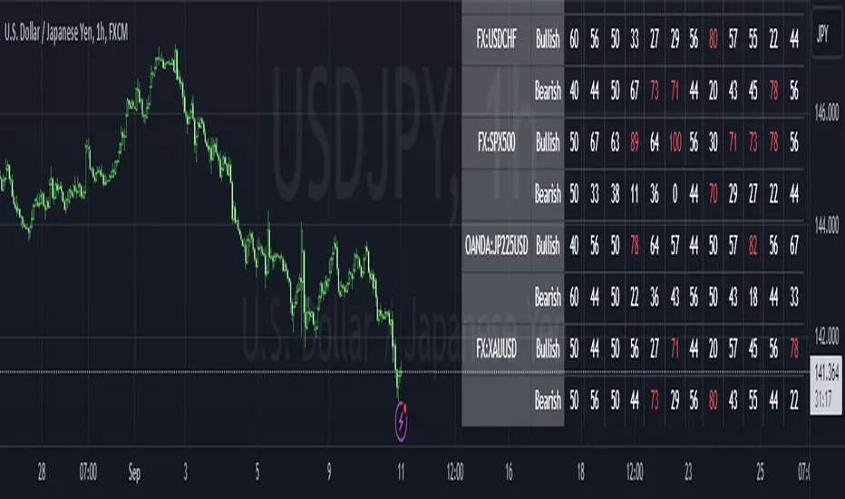
This indicator displays a panel with a list of symbols and their indications.
It can be used as a screener for multiple timess and symbols
in any timeframe and with any indication in any combination.
#### Features
Multiple timeframes
Multiple symbols
Multiple indications per group
Vertical or horizontal layouts
Acceepts External Inputs
Customizable colors with 170 presets included (dark and light)
Customizable icons
Customizable text size and font
Customizable cell size width and height
Customizable frame width and border width
Customizable position
Customizable strong and weak values
Accepts any indicator as input
Only 4 functions to call, easy to use
#### Usage
Initialize the panel with _paneel = cleanscreens.init()
Add groupd with _screener = cleanscreens.Screener(_paneel, "Group Name")
Add indicators to screeener groups with cleanscreens.Indicator(_screener, "Indicator Name", _source)
Update the panel with cleanscreens.display(_paneel)
Thanks @ PineCoders , and the Group members for setting the bar high.
# local setup for methods on our script
import kaigouthro/cleanscreen/1
method Screener ( panel p, string _name) => cleanscreens.Screener ( p, _name)
method Indicator ( screener s , string _tf, string name, float val) => cleanscreens.Indicator ( s , _tf, name, val)
method display ( panel p ) => cleanscreens.display ( p )
init(_themein, loc)
# Panel init
> init a panel for all the screens
Parameters:
_themein (string) : string: Theme Preset Name
loc (int) : int :
1 = left top,
2 = middle top,
3 = right top,
4 = left middle,
5 = middle middle,
6 = right middle,
7 = left bottom,
8 = middle bottom,
9 = right bottom
Returns: panel
method Screener(p, _name)
# Screener - Create a new screener
### Example:
cleanscreens.new(panel, 'Crpyto Screeners')
Namespace types: panel
Parameters:
p (panel)
_name (string)
method Indicator(s, _tf, name, val)
# Indicator - Create a new Indicator
### Example:
cleanscreens.Inidcator('1h', 'RSI', ta.rsi(close, 14))
Namespace types: screener
Parameters:
s (screener)
_tf (string)
name (string)
val (float)
method display(p)
# Display - Display the Panel
### Example:
cleanscreens.display(panel)
Namespace types: panel
Parameters:
p (panel)
indication
single indication for a symbol screener
Fields:
name (series string)
icon (series string)
rating (series string)
value (series float)
col (series color)
tf (series string)
tooltip (series string)
normalized (series float)
init (series bool)
screener
single symbol screener
Fields:
ticker (series string)
icon (series string)
rating (series string)
value (series float)
bg (series color)
fg (series color)
items (indication )
init (series bool)
config
screener configuration
Fields:
strong (series float)
weak (series float)
theme (series string)
vert (series bool)
cellwidth (series float)
cellheight (series float)
textsize (series string)
font (series int)
framewidth (series int)
borders (series int)
position (series string)
icons
screener Icons
Fields:
buy (series string)
sell (series string)
strong (series string)
panel
screener panel object
Fields:
items (screener )
table (series table)
config (config)
theme (theme type from kaigouthro/theme_engine/1)
icons (icons)
Cari dalam skrip untuk " TABLE "

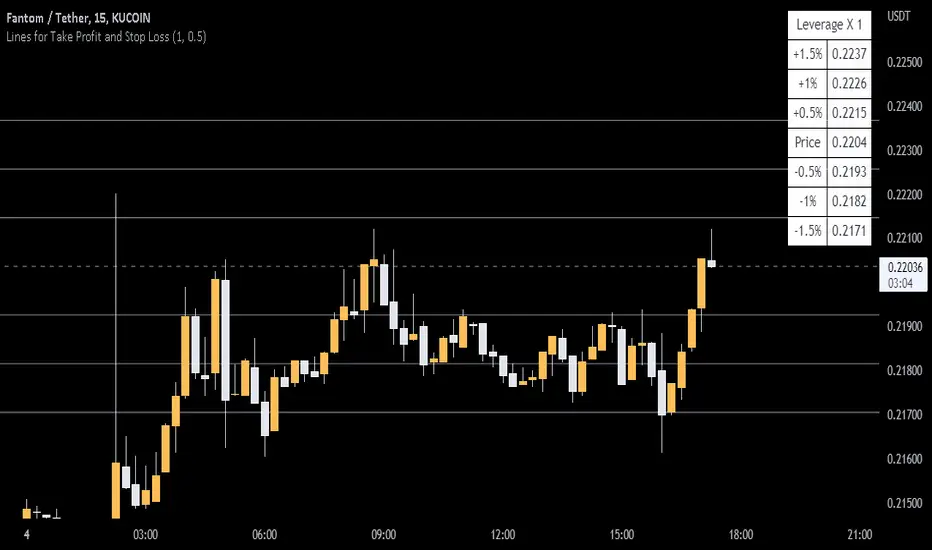
Lines and Table for risk managementABOUT THIS INDICATOR
This is a simple indicator that can help you manage the risk when you are trading, and especially if you are leverage trading. The indicator can also be used to help visualize and to find trades within a suitable or predefined trading range.
This script calculates and draws six “profit and risk lines” (levels) that show the change in percentage from the current price. The values are also shown in a table, to help you get a quick overview of risk before you trade.
ABOUT THE LINES/VALUES
This indicator draws seven percentage-lines, where the dotted line in the middle represents the current price. The other three lines on top of and below the middle line shows the different levels of change in percentage from current price (dotted line). The values are also shown in a table.
DEFAULT VALUES AND SETTINGS
By default the indicator draw lines 0.5%, 1.0%, and 1.5% from current price (step size = 0.5).
The default setting for leverage in this indicator = 1 (i.e. no leverage).
The line closest to dotted line (current price) is calculated by step size (%) * leverage (x) = % from price.
Pay attention to the %-values in the table, they represent the distance from the current price (dotted line) to where the lines are drawn.
* Be aware! If you change the leverage, the distance from the closest lines to the dotted line showing the current price increase.
SETTINGS
1. Leverage: set the leverage for what you are planning to trade on (1 = no leverage, 2 = 2 x leverage, 5 = 5 x leverage...).
2. Stepsize is used to set the distance between the lines and price.
EXAMPLES WITH DIFFERENT SETTINGS
1) Leverage = 1 (no leverage, default setting) and step size 0.5 (%). Lines plotted at (0.5%, 1%, 1.5%, and –0.5%, –1%, –1,5%) from the current price.
2) Leverage = 3 and stepsize 0.5(%). Lines plotted at (1.5%, 3.0%, 4.5%, and –1.5%, –3.0%, –4.5%) from the current price.
3) Leverage = 3 and stepsize 1(%). Lines plotted at (3%, 6%, 9%, and –3%, –6%, –9%) from the current price.
The distance to the nearest line from the current price is always calculated by the formula: Leverage * step size (%) = % to the nearest line from the current price.
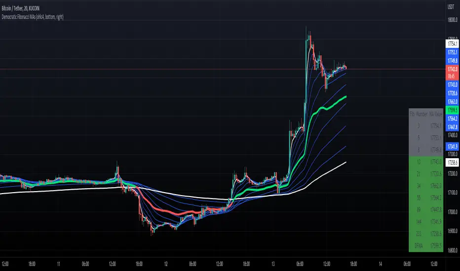
Democratic Fibonacci Moving AveragesWith this indicator, we have taken moving averages at Fibonacci lengths (3 to 233) as well as the average of these values, labeled the DFMA. Additionally, these values have been inputted into a table overlay. The cross of the FibMA(233) and the DFMA can be used as a signal for long or short.
The FibMA lengths of 3 and 233 are plotted in white by default, the FibMAs with lengths between 3 and 233 are plotted in blue by default, and the democratic line (DFMA) that averages these lines is plotted in green or red (depending on if the value is above or below the 233-length FibMA).
© AlpHay : SECURITY FUNDAMENTAL TABLE// Equity Fundamental Data Report Table:
// Data Provider: Tradingview
// I am not a financial advisor or expert.
// This is my interpretation of this data. Consider this data doesn't represent the whole picture of what is going on!
// If you find some fundamentally wrong thinking about this approach, please inform me.
// I am open to suggestions. I am also looking for answers.
// Use it with a daily timeframe for data consistency.
// You can change or customize the threshold values whatever you want.
// www.tradingview.com

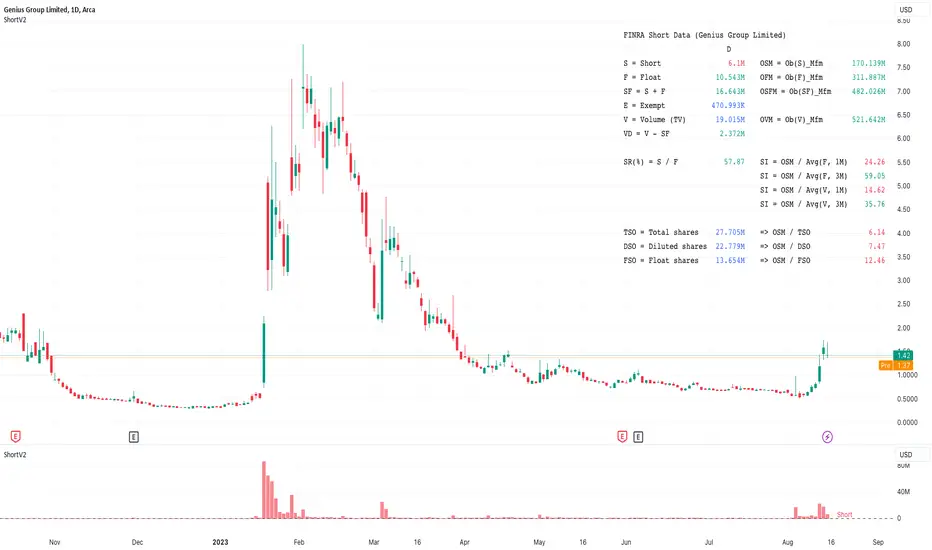
© AlpHay : FINRA SHORT DATA REPORT TABLE with QUANDL Data// Equity Short Data Report Table:
// Data Provider: Quandl => Finra (Nyse + Nasdaq + Bats exchanges)
// I am not a financial advisor or expert.
// This is my interpretation of FINRA's data. Consider this data doesn't represent the whole picture of what is going on!
// If you find some fundementally wrong thinking about this aproach, please inform me.
// I am open to suggestions. I am also looking for answers.
// Use it with a daily timeframe for data consistency.
// You can change the threshold values whatever you want.
// MFM (Money Flow Multiplier):
// mfm = close == high and close == low or high == low ? 0 : (2 * close - low - high) / (high - low)
ATRP & Volatility Table - AIMAN93The ATRP & Volatility Table is a simple yet powerful tool designed to quantify market volatility and help traders adapt their position sizing accordingly.
It calculates the Average True Range Percentage (ATRP) — the ATR value relative to current price — and classifies market conditions into three volatility levels: LOW, MEDIUM, or HIGH. Based on the volatility level, it suggests an indicative risk percentage to guide your trade management.
This visual tool displays real-time ATRP, volatility classification, and corresponding risk percentage in a compact on-chart table. Ideal for systematic traders who rely on volatility-based decision-making, position sizing, or risk management models.
Features:
- Dynamic ATRP calculation for any symbol or timeframe
- Customizable colors for text and background
- Automatic volatility classification (low / medium / high)
- Suggested risk percentage for each volatility level

Soothing Trades - Risk Per Contract Table (1 candle)What it does
A compact risk table for futures/derivatives that estimates adverse move risk per contract from the current bar. It uses bar OHLC and the instrument’s minimum price increment (syminfo.mintick). In this script, a “step” means one minimum price increment (not exchange tick data).
Long Risk = potential adverse move from Close → Low on the active bar.
Short Risk = potential adverse move from Close → High on the active bar.
“Live” rows update while the bar forms.
Per-step currency value defaults to syminfo.pointvalue × syminfo.mintick, or you can set a Custom Per-Step Value (e.g., $5 per 0.25 for NQ).
How to use
Add the indicator and choose where to place the table.
Set your contract quantities (four quick rows).
If the default per-step value doesn’t match your instrument, turn on Use Custom Per-Step Value and enter the correct currency value for one minimum price increment.
Read the columns: Long / Short show estimated adverse risk per row of contracts; “Live” versions update intrabar.
What this is not
It does not use or claim access to historical tick data.
TradingView doesn’t provide tick-data charts; this tool works from bar data only.
It does not place orders or tell you what to trade.
It’s a convenience calculator for sizing awareness.
Notes
Contract specs vary. Always confirm your contract’s point value and minimum price increment with your broker/exchange.
Educational use only. No financial advice.

Cloud and Table - Ostinato TradingMain indicator of Ostinato Trading, the moving averages cloud and table. You can superpose various moving averages, bollinger bands and their color fill. Additionaly the table is used to plot the distance from the price to moving averages, the ATR value, the stop loss ... You can also plot a bulls eyes of SL and TP in points to visualise it on the chart.

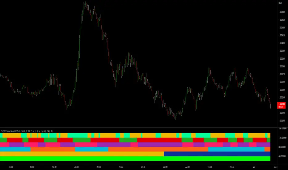
SuperTrend Momentum TableMy goal creating this indicator : Provide a way to see the Past and Current Momentum of multiple different timeframes without using multiple charts.
The Underlying Concept / What is Momentum?
The Momentum shown is derived from a Mathematical Formula, SUPERTREND. When price closes above Supertrend Its bullish Momentum when its below Supertrend its Bearish Momentum.This indicator scans for bullish & bearish Momentum on the Timeframes selected by the user and when there is a shift in momentum on any of those time frames (price closes below or above SUPERTREND ) it notifies the trader with a color change on the Momentum Table.
Back Testing: This indicator will be key for back testing with the SuperTrend-Support-Resistance indicator
since the SuperTrend Momentum Table shows you the visual shift in momentum. Giving the Trader a Clear visual on how Each Support and Resistance Level was made .
Technical Inputs
- If you want to optimize the rate of signals to better fit your trading plan you would change the Factor input and ATR Length input. Increase factor and ATR Length to decrease the frequency of signals and decrease the Factor and ATR Length to increase the frequency of signals.
Quick TIP! : You can Sync all VFX SuperTrend Indicators together! All VFX SuperTrend indicators display unique information but its all derived from that same Momentum Formula. Keep the Factor input and ATR Length the same on other VFX SuperTrend indicators to have them operating on the same data.
Timeframe Inputs
- The indicator has 7 Time frame Displays where you can choose which Time Frames you would like to monitor.
- You can limit the amount of time frames being displayed by changing the Time Frame Amount
Display Inputs
- The trader can specify the bullish and bearish color of all 7 Timeframes
- You can toggle (on or off) the Momentum Switch if you want to highlight the exact candle where momentum switched from bullish to bearish and from bearish to bullish .
How it can be Used ? Check the momentum of other Timeframes and use that information as a variable to structure your trading plan.
- Use Momentum information to track the trend
- Plan and limit trades based on the current Momentum of multiple timeframes
- See if you have higher momentum to fuel your trades
- See breakouts on Multiple Time Frames
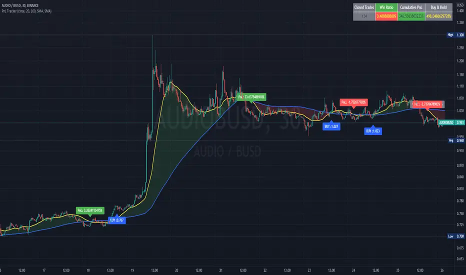
PnL and Buy & Hold TrackerIn this script I use a simple, not necessarily profitable, strategy of a cross of MAs to teach how to calculate and plot the PnL of each trade made by the indicator. I also show how to calculate the cumulative PnL of all trades and the Buy and Hold of the same period.
These calculations which are natively available in any strategy script, require a bit of resourcefulness to work in an indicator script.
It can be very useful to optimize parameters for the best performance of an indicator-based strategy.
I use variables to store the price of the asset at each buy signal to calculate the PnL with the closing price of that particular trade and another variable to store the price value of the first trade, which calculates the Buy and Hold percentage with the current price of the asset.
I plot the values of the trades in labels and the accumulated values in a table.
I also show how to calculate and plot the unrealized PnL of open trades.
OHLC-TablesENGLISH VERSION
The command shows the opening-high-low-closing-change values of that day based on the previous value in each period.
You can set the clock in any time zone you want.
You can use the indicator by adapting it wherever you want on your screen. You can adjust its position. Top-Left-Middle Left- Bottom Left/ Top Right-Middle Right- Bottom Right.
Although it is not a command with a Buy-Sell indicator, its user-friendliness and convenience were taken into account while developing it.
The purpose of the indicator is to allow you to consider the values while focusing not only on the chart you are watching.

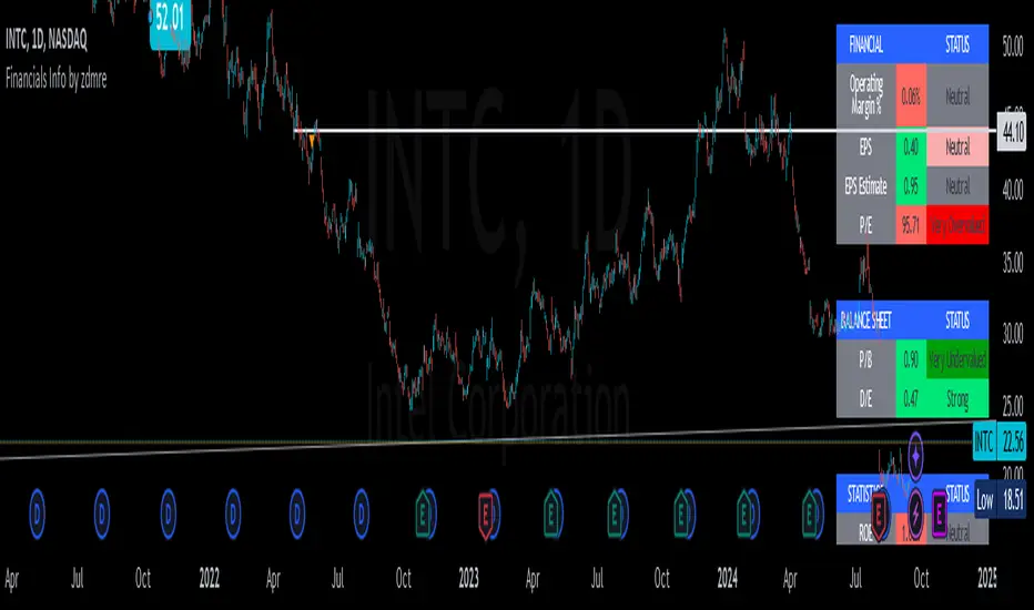
Financials Info by zdmreFundamentals provide a method to set the financial value of a company, security, or currency. Included in fundamental analysis is basic qualitative and quantitative information that contributes to the asset's financial or economic well-being. Macroeconomic fundamentals include topics that affect an economy at large. Microeconomic fundamentals focus on the activities within smaller segments of the economy. For businesses, information such as profitability, revenue, assets, liabilities, and growth potential are considered fundamentals
!!! When you change the values in the filter, you will see that the colors in the table change.
!!! Intrinsic Value Explained
There is no universal standard for calculating the intrinsic value of a company. The formula here is a partially differentiated version of the Ben Graham formula.
Formula;
Intrinsic value = Earning Per Share * MultiplierbySpecialRate * AveragePricetoEarnings * Power(Multiplier by SpecialRate, DiscountYear) * USMoneySupply2 / Power((1 + DiscountRate), DiscountYear) * USMoneySupply0
Simple Watchlist with % Change Screener & AlertsHi fellow traders..
TV has generously increased the number of alerts!!
A Simple Watchlist with heatmap based on % change on daily timeframe.
Gives % change and RSI
you can set the percentage in the input box and then set alerts on your favorite watchlist.
Alerts also include days high and low..
Simple Table and array based code.
set for scrip close >10 can be easily changed in line 43..
Hope you Like it!

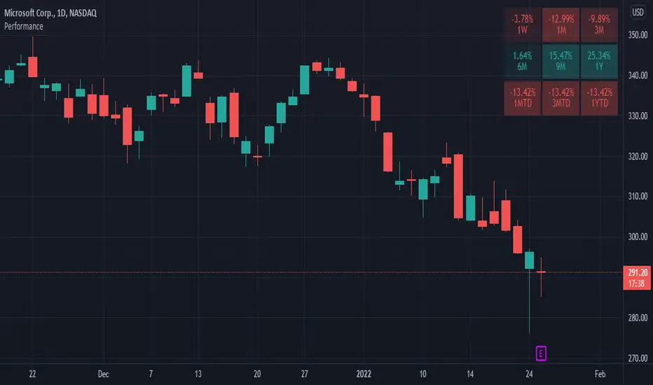
Performance TableThis indicator is based on the Performance section in the TradingView's sidebar and uses new Pine tables functionality. It compares the current price of the symbol to its past price and calculates the rate of return to make it easier to track the performance of the symbol. Note that the Performance sidebar is not updated in real-time, while this indicator is, so on real-time charts the values between the two can differ (the indicator's values are more recent).
The formula of the calculation is (Current value - Past value) * 100 / Past value , where Past value is:
1W - close 5 daily bars ago
1M - close 21 daily bars ago
3M - close 63 daily bars ago
6M - close 126 daily bars ago
YTD - close of the past year
1Y - close 251 daily bars ago


RSI + Stoch + Bollinger — Tableau compact (coin sup. droit)RSI + Stoch + Bollinger — Tableau compact (coin sup. droit)

Bull/Bear Ratio By Month Table [MsF]Japanese below / 日本語説明は英文の後にあります。
-------------------------
This is an indicator that shows monthly bull-bear ratio in a table.
By specifying the start year and end year, the ratio will be calculated and showed based on the number of bullish and bearish lines in the monthly bar. It allows you to analyze the trend of each symbol and month (bullish / bearish). Up to 10 symbols can be specified.
You can take monthly bull-bear ratio for the past 10 or 20 years on the web, but with this indicator, you can narrow it down to the period in which you want to see the symbols you want to see. It is very convenient because you can take statistics at will.
Furthermore, if the specified ratio is exceeded, the font color can be changed to any color, making it very easy to read.
=== Parameter description ===
- From … Year of start of aggregation
- To … Year of end of aggregation
- Row Background Color … Row title background color
- Col Background Color … Column title background color
- Base Text Color … Text color
- Background Color … Background Color
- Border Color … Border Color
- Location … Location
- Text Size … Text Size
- Highlight Threshold … Ratio threshold, and color
- Display in counter? … Check if you want to show the number of times instead of the ratio
-------------------------
月別陰陽確率をテーブル表示するインジケータです。
開始年から終了年を指定することで、月足における陽線数および陰線数を元に確率を計算して表示します。
この機能により各シンボルおよび各月の特徴(買われやすい/売られやすい)を認識することができアノマリー分析が可能です。
シンボルは10個まで指定可能です。
過去10年、20年の月別陰陽確率は、Web上でよく見かけますが、このインジケータでは見たいシンボルを見たい期間に絞って、
自由自在に統計を取ることができるため大変便利です。
なお、指定した確率を上回った場合、文字色を任意の色に変更することができるため、大変見やすくなっています。
=== パラメータの説明 ===
- From … 集計開始年
- To … 集計終了年
- Row Background Color … 行タイトルの背景色
- Col Background Color … 列タイトルの背景色
- Base Text Color … テキストカラー
- Background Color … 背景色
- Border Color … 区切り線の色
- Location … 配置
- Text Size … テキストサイズ
- Highlight Threshold … 色変更する確率の閾値、および色
- Display in counter? … 確率ではなく回数表示する場合はチェックする
VOLQ Sigma TableThis indicator replaces the implied volatility of VOLQ with the daily volatility and reflects that value into the price on the NDX chart to create the VOLQ standard deviation table.
It will only be useful for stocks related to the Nasdaq Index.
For example, NDX, QQQ or so.
And we want to predict the range of weekly fluctuations by plotting those values as a line in the future.
It is expressed as High 2σ by adding the standard deviation 2 sigma value of the VOLQ value from last week's closing price.
It is expressed as High 1σ by adding the standard deviation 1 sigma value of the VOLQ value from last week's closing price.
It is expressed as Low 1σ by subtracting the standard deviation 1 sigma value of the VOLQ value from the closing price of the previous week.
It is expressed as Low 2σ by subtracting the standard deviation 2 sigma value of the VOLQ value from last week's closing price.
1day predicts daily fluctuations.
2day predicts 2-day fluctuations.
3day predicts 3-day fluctuations.
4day predicts 4-day fluctuations.
5day predicts 5-day fluctuations.
In the settings you can select the start date to display the VOLQ line via input.
-----------------------------
What motivated me to create this indicator?
From my point of view, the reason for classifying vix volq historical volatility (realized volatility) is that the most important point is that VIXX and VolQ are calculated from implied volatility. It can be standardized as one-month volatility. There are many strike prices, but exchanges use the implied volatility of options traded on their own exchanges.
Because historical volatility depends on how the period is set, to compare with VIXX, we compare it with a month, that is, 20 business days. One-month implied volatility means (actually different depending on the strike price), because option traders expect that the one-month volatility will be this much, and it is the volatility created by volatility trading.
So we see it as the volatility expected by derivatives traders, especially volatility traders.
I'm trying to infer what the market thinks will fluctuate this much from the numbers generated there.

DeleteArrayObject█ OVERVIEW
Delete array object according to array size such as label, line, linefill, box and table.
█ CREDITS
HeWhoMustNotBeNamed

5:30 AM IST Close + Offset Lines + TablesDescription:
This script captures the 5:30 AM IST close price and plots it on the chart along with dynamic offset levels above and below (±5, ±20, ±40, ±60, ±80 points). It also displays these levels in neatly organized tables at the top-right and bottom-right corners for quick reference.
🔹 Timezone: Asia/Kolkata (IST)
🔹 Useful for: Intraday traders who reference early morning levels
🔹 Visual aids:
Orange line for 5:30 AM close
Green lines for points above
Red lines for points below
Tables summarizing all levels
This tool helps identify key early-morning reference zones that can act as support/resistance or breakout targets.

3-Bar (Outside Bar) Scanner with Table Display# 3-Bar (Outside Bar) Scanner with Table Display
## Overview
The **3-Bar (Outside Bar) Scanner with Table Display** is a custom TradingView indicator designed for traders who utilize **The Strat** methodology. This indicator scans for **3-bar (Outside Bar)** patterns across multiple symbols and displays the results in a convenient table format directly on your chart.
## Purpose
- **Efficient Multi-Symbol Scanning**: Monitor up to four symbols simultaneously for 3-bar patterns without the need to switch between charts.
- **Real-Time Updates**: The table dynamically updates with new price data, providing immediate insights into potential trading opportunities.
- **Visual Clarity**: Displays whether a 3-bar is bullish ("3 Up") or bearish ("3 Down"), helping you quickly interpret market sentiment.
## How It Works
- **Data Retrieval**: The indicator uses `request.security()` to fetch high, low, open, and close prices for the specified symbols and timeframe.
- **3-Bar Detection**:
- **Outside Bar Criteria**: Checks if the current candle's high is higher than the previous candle's high and the current low is lower than the previous low.
- **Direction Determination**:
- **"3 Up"**: If the candle closes higher than it opens (bullish candle).
- **"3 Down"**: If the candle closes lower than it opens (bearish candle).
- **Table Display**:
- The table shows the **Symbol**, **Timeframe**, and **State** ("3 Up", "3 Down", or blank if no pattern detected).
- Customizable colors and positioning to fit your chart's aesthetics.
## Best Use Cases
- **Rapid Market Analysis**: Ideal for traders needing a quick overview of multiple assets for potential 3-bar setups.
- **Strategic Decision-Making**: Helps identify key reversal or continuation patterns in alignment with **The Strat** principles.
- **Scalable Monitoring**: By utilizing TradingView's multi-chart layouts, you can expand monitoring beyond four symbols.
## Instructions for Use
### Adding the Indicator to Your Chart
1. **Copy the Code**: Use the provided Pine Script code for the indicator.
2. **Create a New Indicator**:
- In TradingView, click on **Pine Editor** at the bottom of the platform.
- Paste the code into the editor.
3. **Save and Add to Chart**:
- Click **Save** and give your indicator a name.
- Click **Add to Chart** to apply it.
### Customizing the Inputs
- **Symbols**:
- **Symbol 1**: Leave blank to use the current chart's symbol or enter a specific symbol (e.g., `AAPL`).
- **Symbol 2 to Symbol 4**: Enter additional symbols or leave them blank.
- **Timeframe**: Select your desired timeframe (e.g., `D` for Daily, `60` for 60-minute).
- **Table Colors**:
- Customize header and data colors for better visibility against your chart background.
### Interpreting the Table
- **Symbol**: Displays the symbol without the exchange prefix for clarity.
- **Timeframe**: Shows the timeframe applied to the analysis.
- **State**:
- **"3 Up"**: A bullish outside bar where the candle closed higher than it opened.
- **"3 Down"**: A bearish outside bar where the candle closed lower than it opened.
- **Blank**: No 3-bar pattern detected on the latest candle.
### Monitoring More Than Four Symbols
- **Multi-Chart Layout**:
- Use TradingView's multi-chart feature to display multiple charts within a single workspace.
- Apply the indicator to each chart. For example:
- **Four-Chart Grid**: Monitor up to 16 symbols by setting up four charts, each with the indicator tracking four symbols.
- **Steps**:
1. Arrange your workspace into a multi-chart layout.
2. Add the indicator to each chart.
3. Input different symbols into the indicator on each chart.
## Example Usage
Suppose you want to monitor the following symbols on a Daily timeframe:
- **Symbol 1**: *(Leave blank to use the current chart's symbol, e.g., `SPY`)*
- **Symbol 2**: `AAPL`
- **Symbol 3**: `TSLA`
- **Symbol 4**: `AMZN`
After adding the indicator and entering these symbols:
- **SPY**: The table shows "3 Up" in the State column, indicating a bullish outside bar.
- **AAPL**: No 3-bar pattern detected; the State column is blank.
- **TSLA**: The table shows "3 Down," indicating a bearish outside bar.
- **AMZN**: The table shows "3 Up," indicating another bullish outside bar.
This setup allows you to quickly assess which symbols are exhibiting significant patterns that may warrant further analysis or action.
## Notes
- **Customization**: Feel free to adjust the table's position and colors to suit your preferences.
- **Limitations**:
- Be aware of TradingView's limitations on `request.security()` calls, which may vary based on your subscription plan.
- The indicator is designed to monitor up to four symbols per instance due to these limitations.
- **Scalability**:
- By using multi-chart layouts, you can effectively monitor more symbols without overloading a single chart.
- This approach allows you to scale up your monitoring capabilities to fit your trading strategy.
## Conclusion
The **3-Bar (Outside Bar) Scanner with Table Display** is a valuable tool for traders who utilize **The Strat** methodology. It streamlines the process of identifying key 3-bar patterns across multiple symbols and timeframes, enhancing your ability to make informed trading decisions quickly.
By integrating this indicator into your trading routine, you can:
- Stay alert to significant market movements.
- Reduce the time spent manually scanning charts.
- Increase efficiency in executing your trading strategy.
---
Feel free to share this indicator with the Strat community. Feedback and suggestions are welcome to further enhance its functionality. Happy trading!

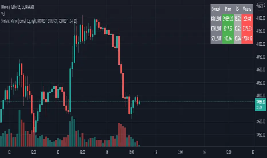
SymMatrixTableSimple Example Table for Displaying Price, RSI, Volume of multiple Tickers on selected Timeframe
Displays Price, RSI and Volume of 3 Tickers and Timeframe selected by user input
Conditional Table Cell coloring
Price color green if > than previous candle close and red if < previous candle close
RSI color green if < 30 and red if > 70 (RSI14 by default)
Volume color green if above average volume and red if less than that (SMA20 volume by default)
Can turn on/off whole table, header columns, row indices, or select individual columns or rows to show/hide
// Example Mixed Type Matrix To Table //
access the simple example script by uncommenting the code at the end
Basically I wanted to have the headers and indices as strings and the rest of the matrix for the table body as floats, then conditional coloring on the table cells
And also the functionality to turn rows and columns on/off from table through checkboxes of user input
Before I was storing each of the values separately in arrays that didn't have a centralized way of controlling table structure
so now the structure is :
- string header array, string index array
- float matrix for table body
- color matrix with bool conditions for coloring table cells
- bool checkboxes for controlling table display